








Design (German)
Why the logo is built like a nigiri and sits on an edge.
Press
Logos and pictures at print resolution, for editorial coverage of moSushi. If something is missing, write to us: we have more than is on this page.
Five versions, each for a purpose
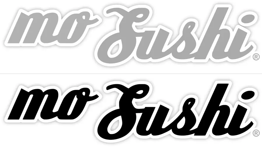
The logo has been unchanged since 2006. Please do not set it anew: the wordmark was nudged into position by hand and cannot be replaced by a typeset line.
 Logo, colourThe standard version. Transparent background. For anything digital and for colour printing.Logo, colourThe same version as a raster image, if your layout program dislikes SVG.
 Logo, black and whiteFor newspaper printing. Please take this one rather than desaturating the colour version, see below.Logo, black and whiteThe same version as a raster image.
 Logo, outline onlyHollow letters, outline only. For very small sizes and difficult printing: no grey to lose, no shadow to fill in.Logo, outline onlyThe same version as a raster image.
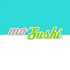 Logo on the edge, squareFor square placements. The mark sits on the colour edge, as it should.Logo on the edge, squareThe same version as a raster image.
 Logo on the edge, landscapeThe same arrangement in landscape, with equal margins all round.Logo on the edge, landscapeThe same version as a raster image.
A test version, not yet released
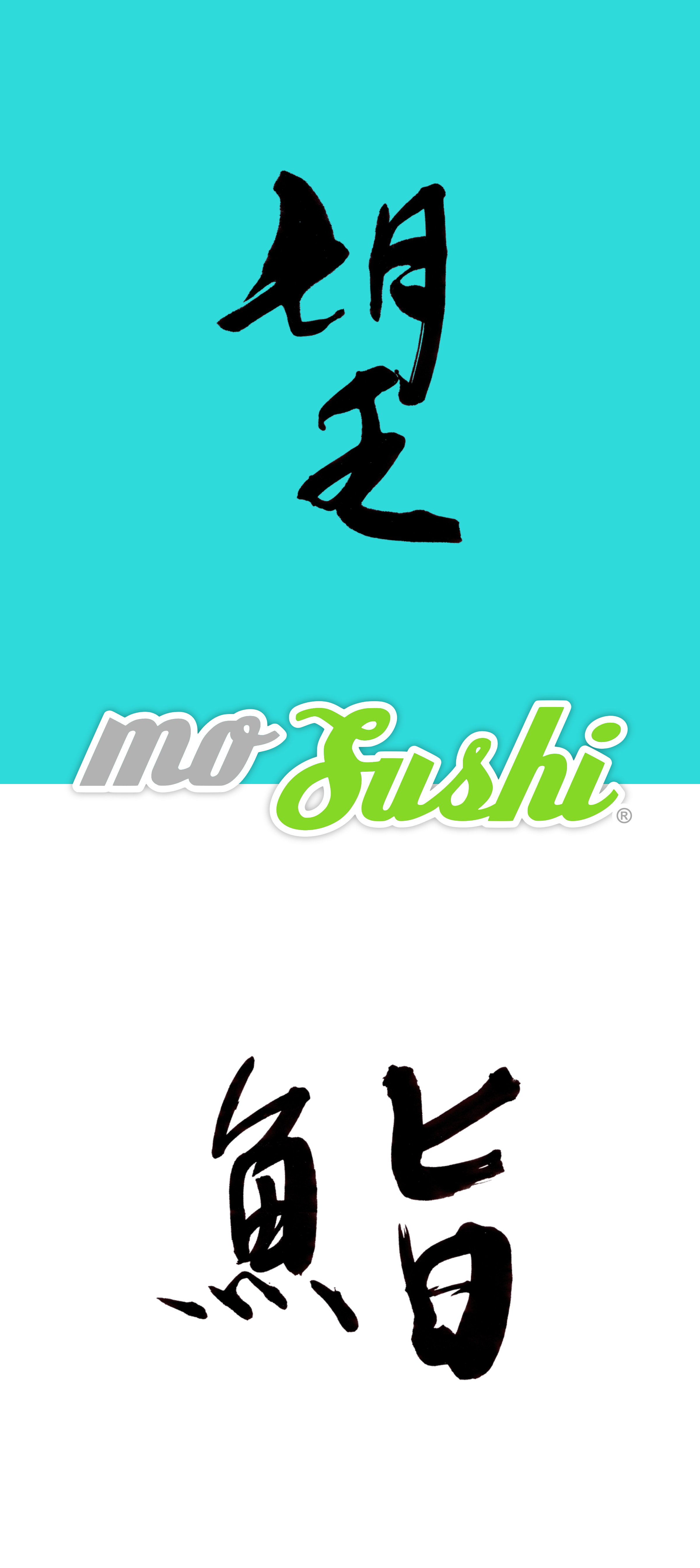
An upright version to try out. The figure follows the vertical Japanese shop sign and the hanging scroll: the name once in Latin letters, once in the 2006 calligraphy, stacked rather than side by side. 望 sits above the wordmark, 鮨 below it, and the colour edge separates them.
For us this is the first workable join of wordmark and kanji after twenty years of attempts. The 2006 logo is untouched by it: this is an additional version, not a replacement.
Marked as a test. If you are writing about us, please take one of the versions above for now.
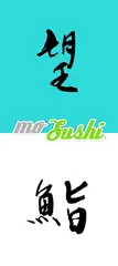 Seal lockup, test versionCalligraphy as an embedded image, wordmark as vector. Without the artist's seal.Seal lockup, test versionThe same version as a raster image.
A note for newspaper printing
Desaturating the colour version gives you an unusable image. The green turns to a middling grey, the grey of the “mo” goes almost white, and the soft shadow disappears entirely. On newsprint what is left is a pale smudge.
The black and white version is therefore drawn anew rather than converted: both parts of the word in full black, the white outline kept, the shadow removed. It stands on any background.
In short: please download the black and white file rather than converting the colour one.
At print resolution, free of charge for coverage
Every picture comes from our own operation. No guest is identifiable on any of them: what you get here is the craft, the goods and the room.
New photographs appear on Instagram: @mosushi_official. If you see something there you would like to print, ask us for the file at print resolution.
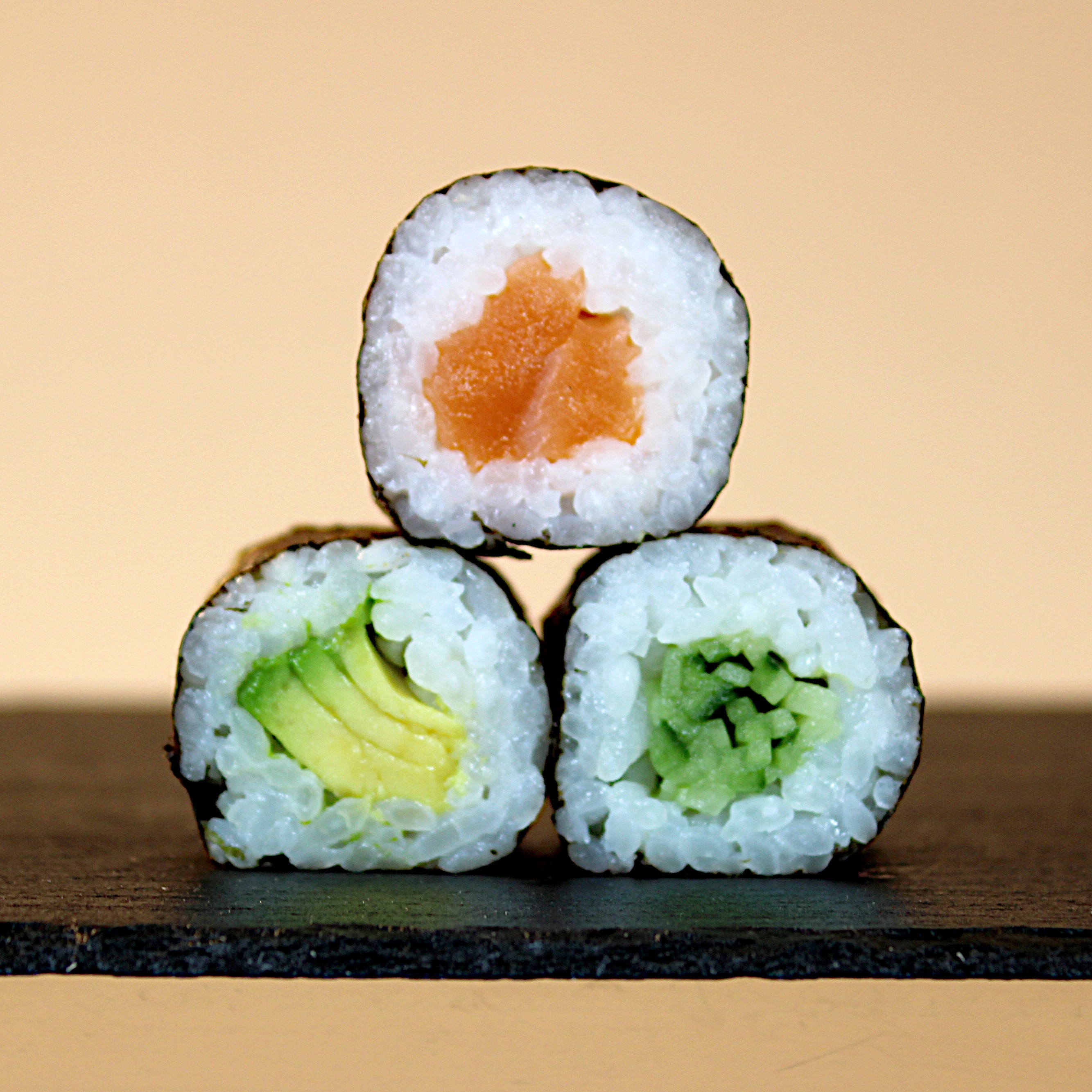
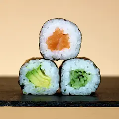 Hosomaki on slateThree pieces from the class, stacked.
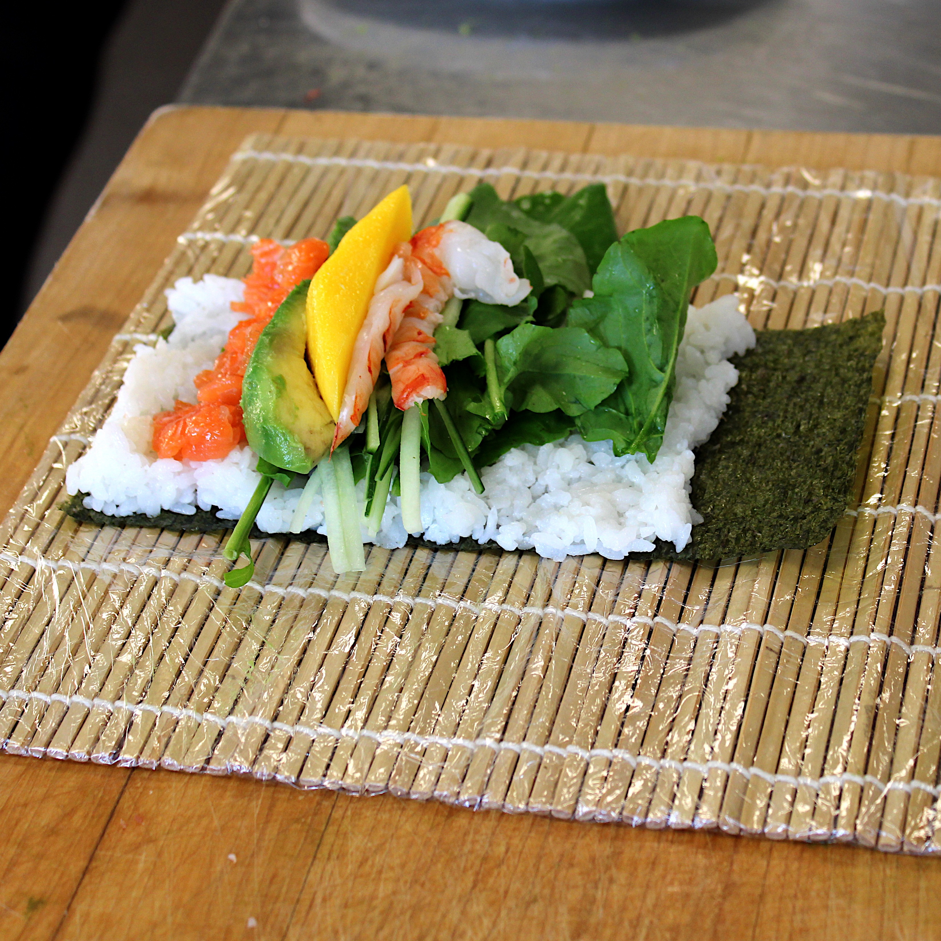
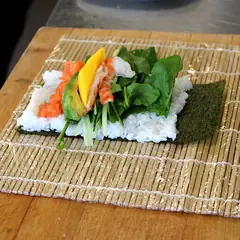 Chumaki before rollingThe ingredients lie on the nori, the mat is ready.
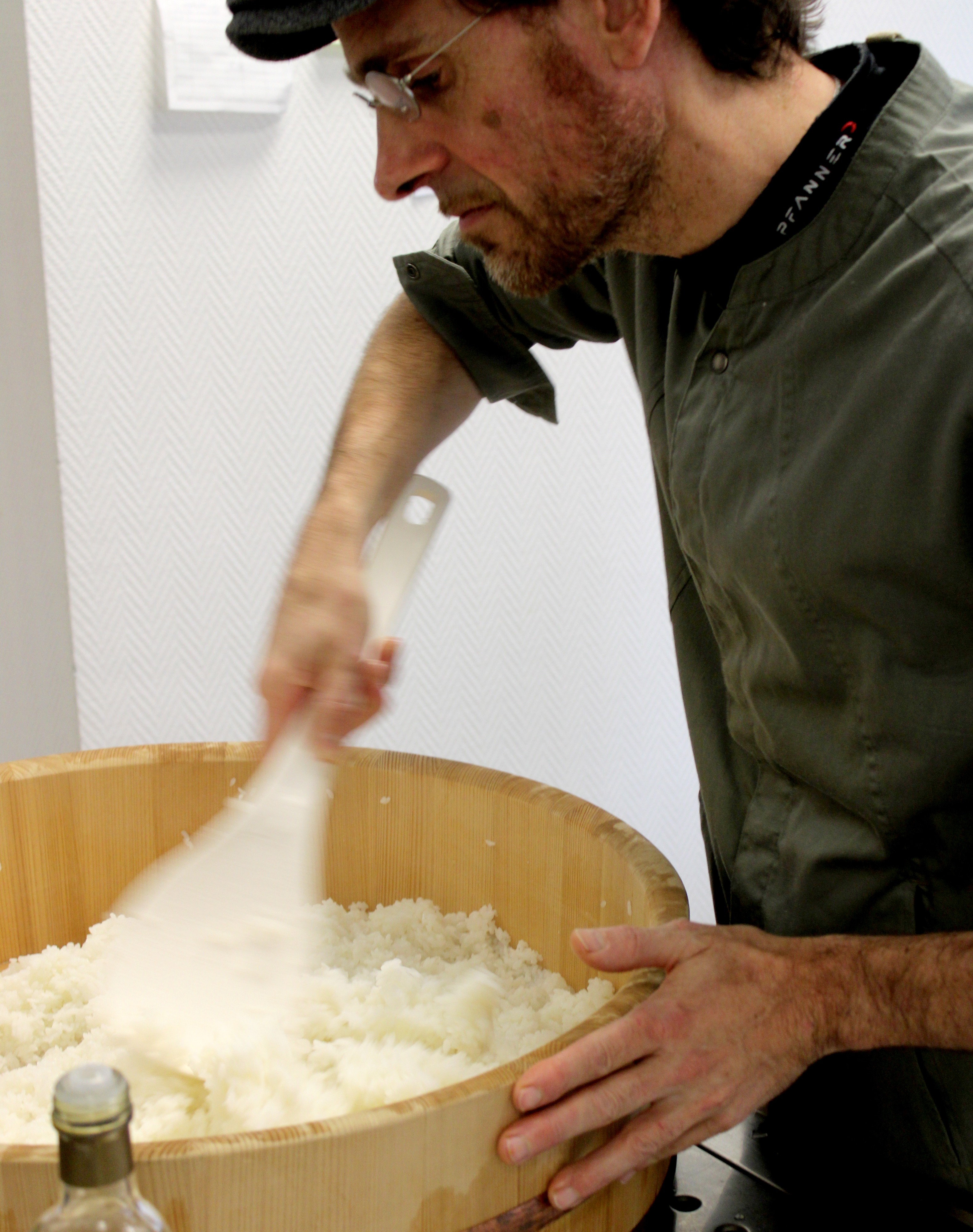
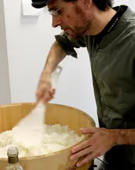 The rice in the hangiriThe sushi rice is mixed by hand.
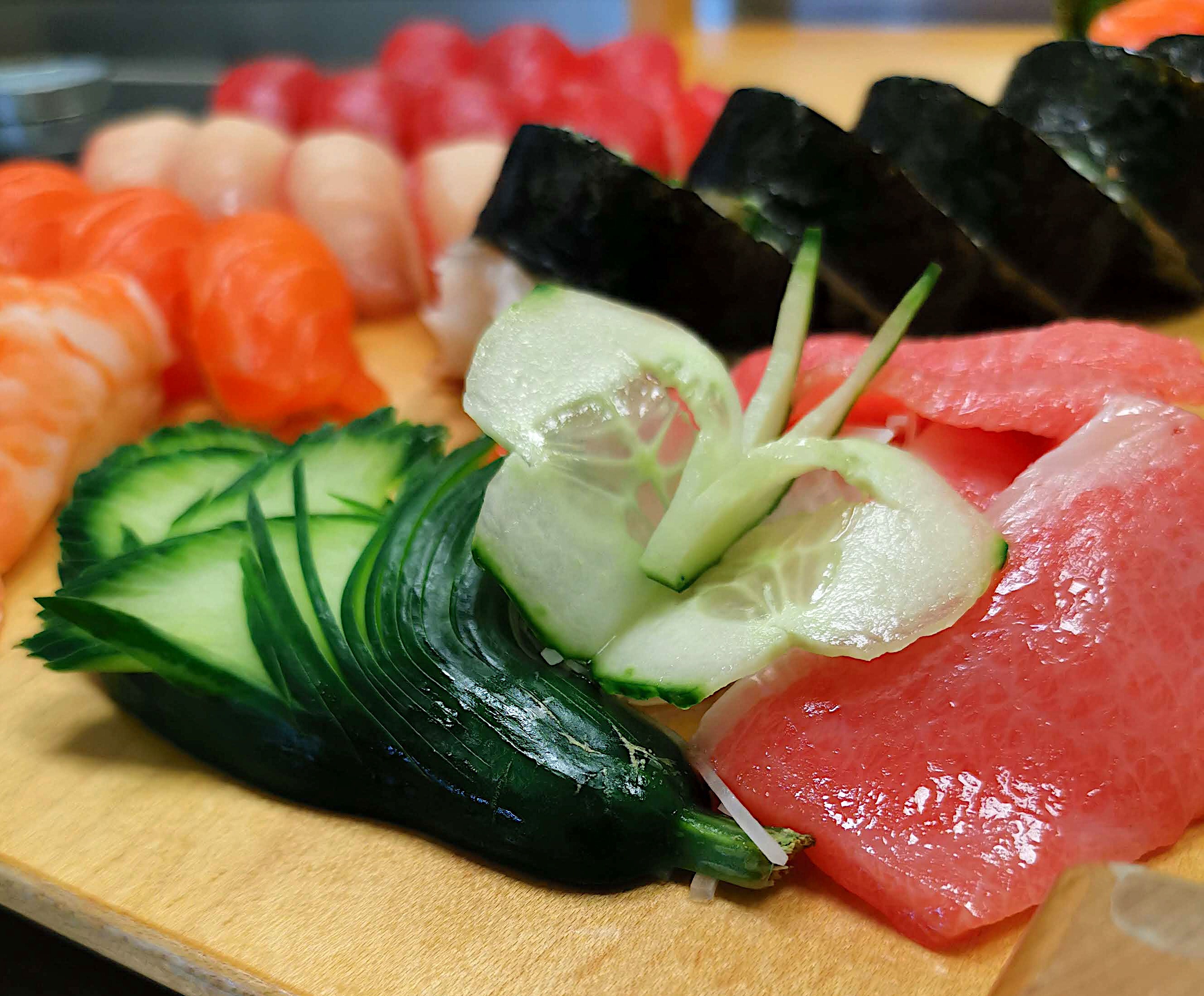
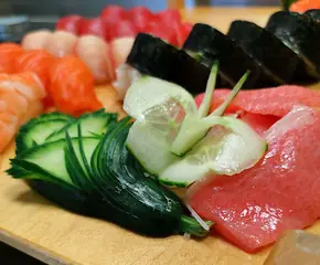 Sashimi with decorationCut vegetables as the trimming.
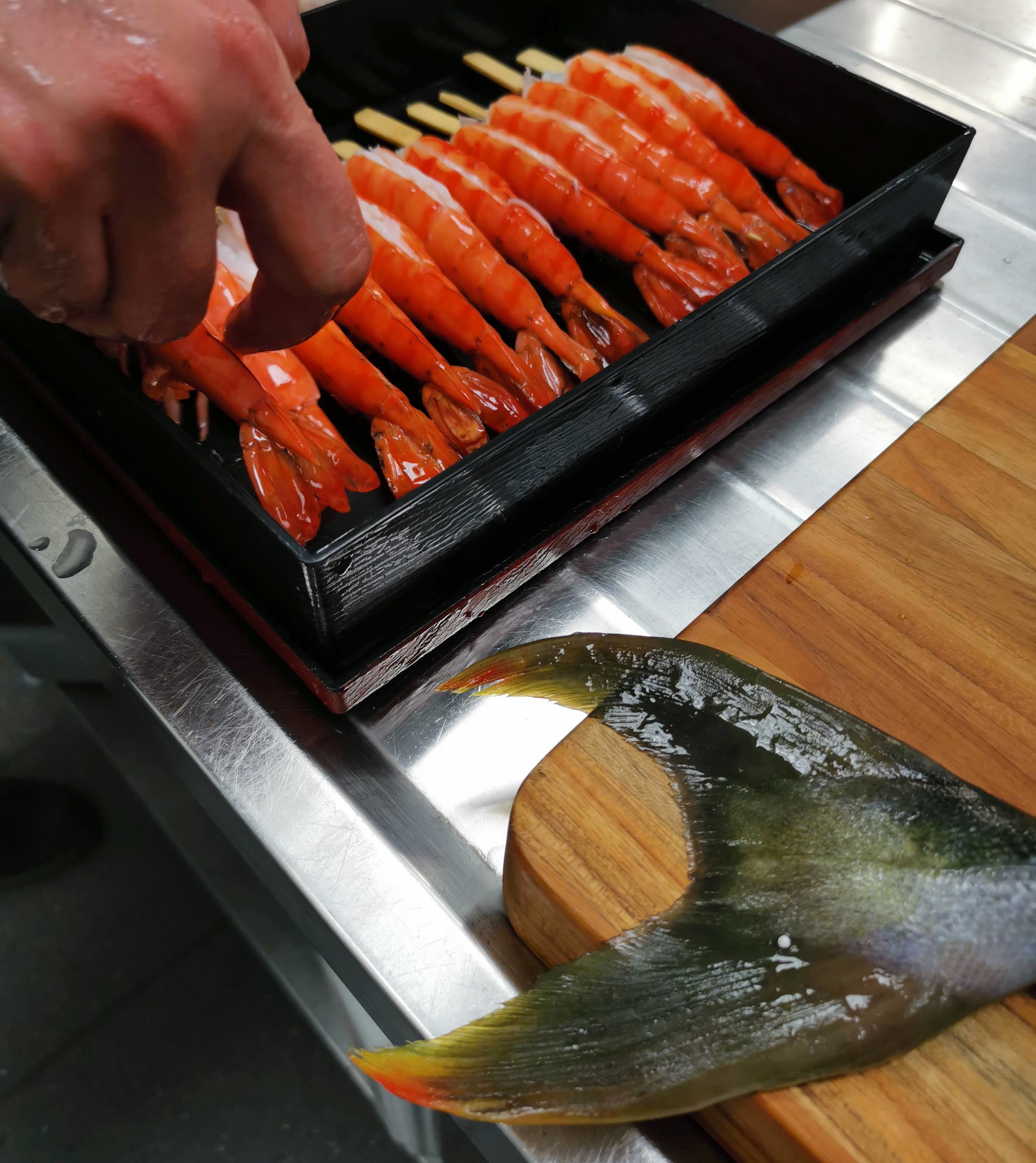
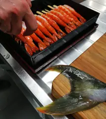 Prawn and hamachiA cooked prawn beside the tail cut.
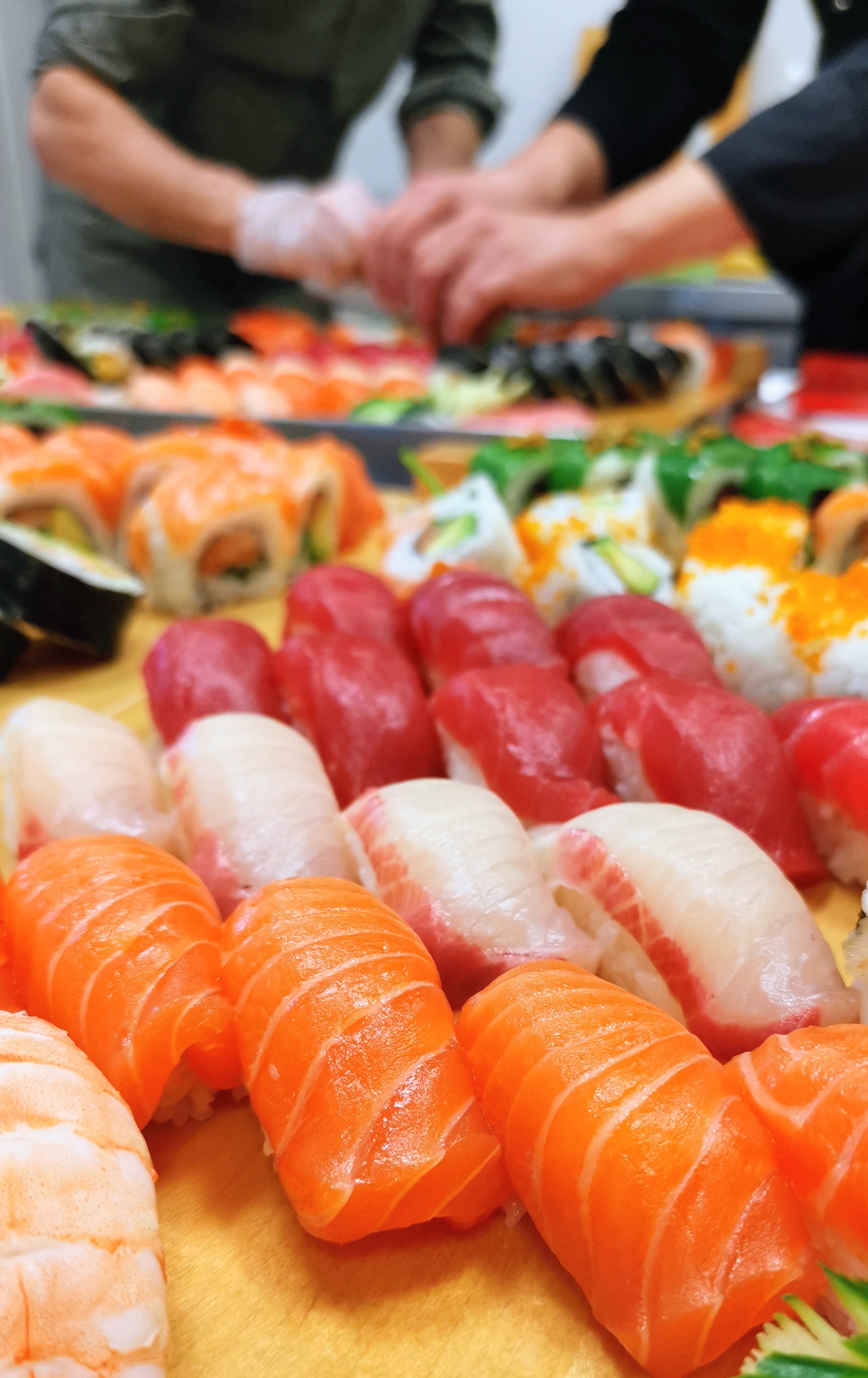
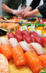 Arranging a platterFour hands over a sushi platter being built.
What you may do with it
You may use the logos and pictures on this page free of charge for editorial coverage of moSushi, in print and online.
Please credit moSushi as the source. Cropping and brightness correction are fine; please no montages and no advertising.
Need a different motif, a higher resolution, a quote or an appointment on site? Write to info@mosushi.de or call +49 2132 67 375 40. We have considerably more material than fits on this page.
Pages that are not in the menu
Why the logo is built like a nigiri and sits on an edge.
What 望鮨 means and who painted it in 2006.